Discover why guests abandon mobile check-in forms and how to fix it. Master form length, trust signals, and messaging timing.
.webp)
Your guest is in an Uber heading to your hotel. They open the check-in link you sent. The form loads. They see 25 fields staring back at them. They close the browser.
This happens more than you think.
Guests want to check in on their phones. The data proves it. But somewhere between opening your form and hitting submit, they bail. The problem isn't your technology. It's not your guests. It's the friction you're creating.
Most hotels don't measure where guests drop off. They just know completion rates are lower than expected. You're losing 40-60% of guests who start the process.
Here's what separates hotels with 70% completion rates from those stuck at 15%: form length, trust signals, and timing.
Before you fix anything, you need to understand why guests quit.
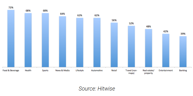
The numbers are sobering. Data shows that 52% of users have abandoning an online booking due to a bad experience. In hospitality specifically, the problem is even worse. Guests are exhausted from travel. They're impatient. They have zero tolerance for friction.
Research from Baymard Institute found that 18% of users abandon forms because they're too long or ask for too much information. Add in security concerns (29% of abandonment), poor mobile design, and confusing instructions, and you're looking at a leaky funnel.
more than 75% of guests prefer hotels with self-service check-in.
60% of hotel searches now happen on phones. This number keeps growing. Yet most check-in forms are designed for desktop, not mobile. Small fields. Tiny buttons.
Autocomplete that doesn't work. Your guests are trying to fill out a form in a moving vehicle or while standing in your lobby.
They don't abandon randomly. They quit when:
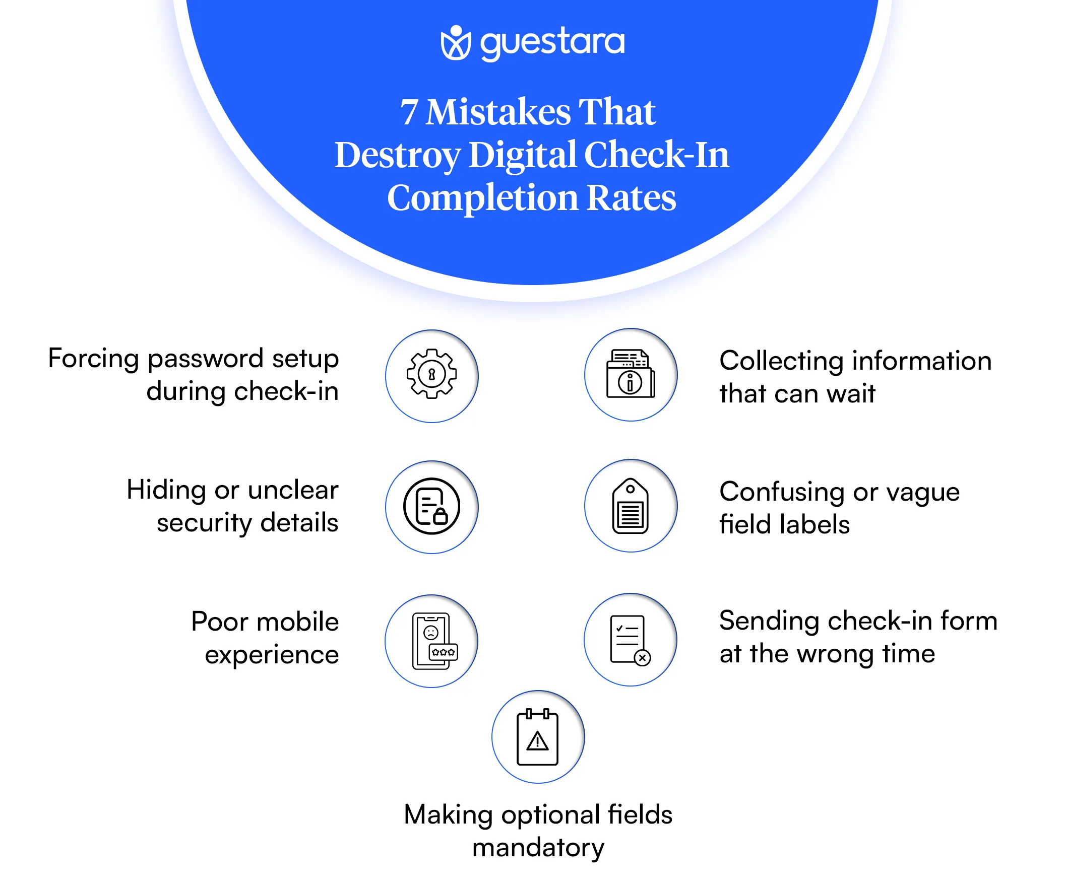
Your form asks for information they don't understand The form keeps asking for more and more fields They see payment information being asked for before they know their room number Trust signals are missing (security badges, privacy info) The form on mobile requires horizontal scrolling or zooming Error messages are confusing They can't see their progress
Let's start with the obvious problem. Long forms don't work.
When you ask for 20 fields, completion rates drop. When you ask for 5 fields, they skyrocket. This isn't debatable. This is measured fact.
Studies on hotel booking abandonment show that every additional required field decreases completion by 3-5%. If your form has 20 required fields instead of 10, you're looking at 30-50% lower completion.
Think about what you're actually collecting:
Full name (required) Email address (required) Phone number (required) Address (required) City, state, zip (required) Nationality (sometimes required) ID information (often manual entry) Payment method (required) Billing address (often separate from guest address) Emergency contact (sometimes required) Room preferences (optional but you're asking anyway) Special requests (optional) Marketing consent (sometimes required)
That's 12+ fields right there. Your guests haven't even finished the intake and they're already thinking about bailing.
Start with this core set:
Name Email Phone Room preferences (optional) Payment authorization
That's it. Everything else can wait. Passport information? Collect it after they confirm their room. Billing address? Their credit card on file usually handles that. Emergency contact? Store it for future visits.
The magic number is between 3-5 core questions. After that, every additional field drops completion by meaningful percentages.
Split information across multiple screens. Ask 3 questions per screen instead of 12 on one page.
Screen 1: Name, email, phone Screen 2: ID verification (scan photo) Screen 3: Payment authorization Screen 4: Room preferences and special requests
Use progress indicators. Show guests they're on "Step 2 of 4." They'll complete it if they know it's short.
Use conditional logic. If they don't need early check-in, don't ask for early arrival preference. If they're not international, don't ask for passport information. Collect information based on their booking type.
Here's what kills mobile check-in more than long forms: security concerns.
When guests pull up a check-in form on their phone and see no security signals, something clicks in their brain. "Am I giving my credit card information to a secure site?" "Is my ID photo safe?" "Will they sell my data?"
Research shows 29% of form abandonment is due to security concerns. That's nearly 3 out of 10 guests quitting because they don't feel safe.
You don't have to be a cybersecurity expert to fix this. You just need to show visible trust signals.
Security badges matter. Display trust seals like SSL, PCI DSS, or your hotel's certifications prominently. Don't hide them at the bottom of the form. Put them near the payment section.
Show who's collecting the data. Use clear language: "Your information is encrypted and secure" or "We use industry-standard encryption to protect your data."
Explain privacy. Add a brief line like "Your information is used only for your stay and never shared with third parties." Link to your privacy policy. Make it easy.
Use familiar payment methods. If you accept Apple Pay or Google Pay, show it. Guests trust these methods. It's one less place they have to type information.
Show guest testimonials. Include a quote from a recent guest on the check-in form: "Super fast and easy check-in. I was in my room in 2 minutes." This signals that other guests have safely completed this process.
Display your hotel name prominently. Use your logo. Make it clear this form is from your actual hotel, not a phishing scam.
Generic forms with no branding No security indicators Vague language like "This form is secure" Asking for unnecessary information (why does check-in need your mother's maiden name?) No contact information if something goes wrong Privacy policy buried in tiny text
You can have the perfect form. If you send it at the wrong time, guests still won't complete it.
When guests receive the check-in link determines whether they use it. Send too early, they forget. Send too late, they're already at your hotel. Send during their work day, they ignore it. Send at 11 PM, they're asleep.
Research on travel behavior shows that guests prefer to complete tasks before arrival when they're:
At home before they leave (24-48 hours before) At the airport waiting for their flight At lunch or downtime before traveling In the evening before travel day
Avoid: during work hours (8-5), very early morning, and late at night.
Message 1 (3-4 days before): Confirmation message with soft introduction to check-in option. Don't push the link yet. Just plant the seed. "Your stay is confirmed. When you're ready, complete check-in on your phone."
Message 2 (24 hours before): Detailed check-in invitation. Now you can be more direct. "Complete check-in in 2 minutes. All you need is your ID." Include the link.
Message 3 (3-6 hours before arrival): Final reminder. "Still haven't checked in? No problem. Do it now or skip to the front desk when you arrive." This removes pressure.
For complete guide check out Self Check In Hotel: Benefits, Technology & Implementation Guide.
Test these windows:
For business travelers: 6-9 AM on travel day, or 2-4 PM before travel day For leisure travelers: 10 AM-12 PM (morning coffee time), or 6-8 PM evening before For international guests: Check their timezone. A guest flying from Singapore may be completely different from one flying from Germany.
Track open rates and click-through rates by send time. Your data will tell you what works.
You can't have a mobile check-in form that isn't actually optimized for mobile.
This sounds obvious. It's not. Many hotels build forms on desktop, test on desktop, then launch. Guests filling out forms on an iPhone have a completely different experience.
Large buttons (bigger than 44px). Guests are using thumbs, not mouse cursors. Tiny buttons cause frustration and misclicks.
Single-column layout. No horizontal scrolling. No zooming required.
Large input fields. Text should be readable without glasses or zooming.
Autofill enabled. Let the browser fill in email, address, phone number automatically.
One field per line. Not side-by-side fields that shrink on mobile.
Mobile number pad for phone numbers. When guests tap a phone field, show the numeric keyboard.
Date pickers that work. Don't ask guests to type 01/15/1990. Show a calendar picker.
Autocomplete for common fields. Name, email, city, state. Pre-fill when possible.
Error messages that appear inline. Not in a popup at the top of the page. Guests need to know immediately what went wrong.
Don't just check your form on an iPhone simulator. Test on an actual iPhone 12, iPhone 15, Samsung Galaxy, and Android phone. Different devices render differently.
Test on slow 4G connections, not WiFi. Your form might load fine on 5G but timeout on bad hotel WiFi.
Test in different browsers. Chrome, Safari, Firefox. They all handle forms differently.
This is where you separate from competitors.
Manual ID entry is a primary drop-off point. Guests have to type their name, passport number, date of birth, everything manually. Typos happen. Form gets rejected. They abandon.
AI-powered ID scanning removes this friction entirely.
Instead of typing, guests just take a photo of their ID or passport. The system reads it automatically. They verify the information (almost always correct), then submit.
Completion rates jump 30-40% immediately.
It's faster. Photo takes 5 seconds. Manual entry takes 2 minutes.
It's more accurate. No typos. No back-and-forth because they entered their name wrong.
It feels secure. Guests trust technology companies like Apple and Google with their face recognition. They'll trust a secure ID scanner.
For international guests, it's transformational. Passport information is complex. Complex information = abandonment. Scanning removes all friction.
Don't ask for ID type first. Just ask them to upload a photo. Let the system detect whether it's a passport, driver's license, or national ID.
Show a progress bar while scanning. Guests want to know their photo is being processed.
Display the information your system extracted. Let guests verify it before submitting. This builds confidence.
Guests need to know where they are in the process.
When you show "Step 2 of 4," something happens psychologically. They know the end is in sight. They're 50% done. They keep going.
When you don't show progress, guests have no idea how much longer the form will take. They assume it's infinite. They quit.
Visual progress bar at the top. Green bar filling from left to right.
Text underneath: "Step 2 of 4: ID Verification"
Estimated time: "About 1 minute left"
Section completion badges: Checkmarks next to completed sections.
Next button that clearly says what's coming: Instead of "Next," say "Next: Room Preferences" so they know exactly what section is coming.
These small signals double completion rates.
Here's a psychological trick that works: tell guests they don't have to complete mobile check-in.
When people feel trapped, they bail. When you give them an easy out, they stay.
Try this messaging: "Complete check-in on your phone in 2 minutes, or just skip to the front desk when you arrive. Either way, we'll get you settled fast."
Removing pressure paradoxically increases completion. Guests feel in control. They're not being forced. So they proceed.
The same principle applies throughout the form. Offer options. "Prefer not to upload your ID right now? You can do it when you arrive."
Guests who have an escape hatch often don't use it. But knowing it exists makes them more likely to proceed.
Don't ask guests to create an account during check-in. Optional account creation is fine. Mandatory? Completion plummets. Save this for post-check-in or future stays.
Room service preferences, breakfast time, housekeeping schedule. None of this is urgent. Collect it after they've checked in and settled.
Don't put "This form is secure" in tiny text at the bottom. Put "PCI Compliant" and security badges near the payment field where guests enter their card.
"Emergency contact person" is clearer than "Kin info." "Phone number for the reservation" is clearer than "Alt. contact."
Testing on desktop only and assuming it works on mobile is a death knell. Redesign specifically for thumbs, small screens, and touch.
Sending check-in at 6 AM when your guests are sleeping, or at 8 PM when they're at dinner. Send when they have time and attention.
"Please tell us your room preferences." Optional. Don't make it required. Not everyone has room preferences.
You can't improve what you don't measure.
Track these metrics for your mobile check-in form:
Form Load Rate: How many guests open the link vs. how many you sent it to. If it's under 40%, your messaging isn't compelling or timing is off.
Completion Rate by Step: Which step loses the most guests? Step 1 (name, email, phone)? Step 2 (ID upload)? Step 3 (payment)? Fix the leakiest step first.
Time to Complete: How long does it take successful completers? If it's 5+ minutes, your form is too long.
Drop-off Points: Use analytics to see exactly where guests quit. Is it after the payment field? After ID scanning? This tells you what's causing fear.
Mobile vs. Desktop: Are mobile completions lower than desktop? If so, redesign for mobile specifically.
Device Type: Do iPhone users complete at different rates than Android users? Does this vary by form section?
Browser: Does Safari perform differently than Chrome? Test and optimize accordingly.
Remember self check-in is becoming the new standard in the hotel industry. Your metrics should reflect how you're performing relative to that standard. Track your completion rate against benchmark data from leading hotels. If you're at 25% completion while industry leaders are at 60%+, you have clear improvement targets.
The Self Check-In Hotel Formula That Works
Put it all together and here's what hotels with high completion rates have in common:
The hotels competing with you have figured out that self check-in isn't about technology. It's about psychology. Remove friction. Build trust. Show progress. Time it right.
Don't wait for perfect. Start with one change.
Week 1: Audit your current form. Count fields. Identify which ones are truly required for check-in vs. nice-to-have.
Week 2: Reduce your form to 5 core questions. Move everything else to post-check-in.
Week 3: Add trust signals. SSL badges, privacy statement, security certification.
Week 4: Test mobile experience. Get a colleague to fill out your form on their phone. Note every friction point.
Week 5: Implement mobile redesign. Larger buttons. Single column. Progress indicators.
Week 6: Run A/B tests. Try different timings for your check-in message. Track completion by send time.
This isn't a one-time project. This is continuous improvement. Your form in 3 months will be different from your form today. That's the point.


Discover why guests abandon mobile check-in forms and how to fix it. Master form length, trust signals, and messaging timing.
Your guest is in an Uber heading to your hotel. They open the check-in link you sent. The form loads. They see 25 fields staring back at them. They close the browser.
This happens more than you think.
Guests want to check in on their phones. The data proves it. But somewhere between opening your form and hitting submit, they bail. The problem isn't your technology. It's not your guests. It's the friction you're creating.
Most hotels don't measure where guests drop off. They just know completion rates are lower than expected. You're losing 40-60% of guests who start the process.
Here's what separates hotels with 70% completion rates from those stuck at 15%: form length, trust signals, and timing.
Before you fix anything, you need to understand why guests quit.
The numbers are sobering. Data shows that 52% of users have abandoning an online booking due to a bad experience. In hospitality specifically, the problem is even worse. Guests are exhausted from travel. They're impatient. They have zero tolerance for friction.
Research from Baymard Institute found that 18% of users abandon forms because they're too long or ask for too much information. Add in security concerns (29% of abandonment), poor mobile design, and confusing instructions, and you're looking at a leaky funnel.
more than 75% of guests prefer hotels with self-service check-in.
60% of hotel searches now happen on phones. This number keeps growing. Yet most check-in forms are designed for desktop, not mobile. Small fields. Tiny buttons.
Autocomplete that doesn't work. Your guests are trying to fill out a form in a moving vehicle or while standing in your lobby.
They don't abandon randomly. They quit when:
Your form asks for information they don't understand The form keeps asking for more and more fields They see payment information being asked for before they know their room number Trust signals are missing (security badges, privacy info) The form on mobile requires horizontal scrolling or zooming Error messages are confusing They can't see their progress
Let's start with the obvious problem. Long forms don't work.
When you ask for 20 fields, completion rates drop. When you ask for 5 fields, they skyrocket. This isn't debatable. This is measured fact.
Studies on hotel booking abandonment show that every additional required field decreases completion by 3-5%. If your form has 20 required fields instead of 10, you're looking at 30-50% lower completion.
Think about what you're actually collecting:
Full name (required) Email address (required) Phone number (required) Address (required) City, state, zip (required) Nationality (sometimes required) ID information (often manual entry) Payment method (required) Billing address (often separate from guest address) Emergency contact (sometimes required) Room preferences (optional but you're asking anyway) Special requests (optional) Marketing consent (sometimes required)
That's 12+ fields right there. Your guests haven't even finished the intake and they're already thinking about bailing.
Start with this core set:
Name Email Phone Room preferences (optional) Payment authorization
That's it. Everything else can wait. Passport information? Collect it after they confirm their room. Billing address? Their credit card on file usually handles that. Emergency contact? Store it for future visits.
The magic number is between 3-5 core questions. After that, every additional field drops completion by meaningful percentages.
Split information across multiple screens. Ask 3 questions per screen instead of 12 on one page.
Screen 1: Name, email, phone Screen 2: ID verification (scan photo) Screen 3: Payment authorization Screen 4: Room preferences and special requests
Use progress indicators. Show guests they're on "Step 2 of 4." They'll complete it if they know it's short.
Use conditional logic. If they don't need early check-in, don't ask for early arrival preference. If they're not international, don't ask for passport information. Collect information based on their booking type.
Here's what kills mobile check-in more than long forms: security concerns.
When guests pull up a check-in form on their phone and see no security signals, something clicks in their brain. "Am I giving my credit card information to a secure site?" "Is my ID photo safe?" "Will they sell my data?"
Research shows 29% of form abandonment is due to security concerns. That's nearly 3 out of 10 guests quitting because they don't feel safe.
You don't have to be a cybersecurity expert to fix this. You just need to show visible trust signals.
Security badges matter. Display trust seals like SSL, PCI DSS, or your hotel's certifications prominently. Don't hide them at the bottom of the form. Put them near the payment section.
Show who's collecting the data. Use clear language: "Your information is encrypted and secure" or "We use industry-standard encryption to protect your data."
Explain privacy. Add a brief line like "Your information is used only for your stay and never shared with third parties." Link to your privacy policy. Make it easy.
Use familiar payment methods. If you accept Apple Pay or Google Pay, show it. Guests trust these methods. It's one less place they have to type information.
Show guest testimonials. Include a quote from a recent guest on the check-in form: "Super fast and easy check-in. I was in my room in 2 minutes." This signals that other guests have safely completed this process.
Display your hotel name prominently. Use your logo. Make it clear this form is from your actual hotel, not a phishing scam.
Generic forms with no branding No security indicators Vague language like "This form is secure" Asking for unnecessary information (why does check-in need your mother's maiden name?) No contact information if something goes wrong Privacy policy buried in tiny text
You can have the perfect form. If you send it at the wrong time, guests still won't complete it.
When guests receive the check-in link determines whether they use it. Send too early, they forget. Send too late, they're already at your hotel. Send during their work day, they ignore it. Send at 11 PM, they're asleep.
Research on travel behavior shows that guests prefer to complete tasks before arrival when they're:
At home before they leave (24-48 hours before) At the airport waiting for their flight At lunch or downtime before traveling In the evening before travel day
Avoid: during work hours (8-5), very early morning, and late at night.
Message 1 (3-4 days before): Confirmation message with soft introduction to check-in option. Don't push the link yet. Just plant the seed. "Your stay is confirmed. When you're ready, complete check-in on your phone."
Message 2 (24 hours before): Detailed check-in invitation. Now you can be more direct. "Complete check-in in 2 minutes. All you need is your ID." Include the link.
Message 3 (3-6 hours before arrival): Final reminder. "Still haven't checked in? No problem. Do it now or skip to the front desk when you arrive." This removes pressure.
For complete guide check out Self Check In Hotel: Benefits, Technology & Implementation Guide.
Test these windows:
For business travelers: 6-9 AM on travel day, or 2-4 PM before travel day For leisure travelers: 10 AM-12 PM (morning coffee time), or 6-8 PM evening before For international guests: Check their timezone. A guest flying from Singapore may be completely different from one flying from Germany.
Track open rates and click-through rates by send time. Your data will tell you what works.
You can't have a mobile check-in form that isn't actually optimized for mobile.
This sounds obvious. It's not. Many hotels build forms on desktop, test on desktop, then launch. Guests filling out forms on an iPhone have a completely different experience.
Large buttons (bigger than 44px). Guests are using thumbs, not mouse cursors. Tiny buttons cause frustration and misclicks.
Single-column layout. No horizontal scrolling. No zooming required.
Large input fields. Text should be readable without glasses or zooming.
Autofill enabled. Let the browser fill in email, address, phone number automatically.
One field per line. Not side-by-side fields that shrink on mobile.
Mobile number pad for phone numbers. When guests tap a phone field, show the numeric keyboard.
Date pickers that work. Don't ask guests to type 01/15/1990. Show a calendar picker.
Autocomplete for common fields. Name, email, city, state. Pre-fill when possible.
Error messages that appear inline. Not in a popup at the top of the page. Guests need to know immediately what went wrong.
Don't just check your form on an iPhone simulator. Test on an actual iPhone 12, iPhone 15, Samsung Galaxy, and Android phone. Different devices render differently.
Test on slow 4G connections, not WiFi. Your form might load fine on 5G but timeout on bad hotel WiFi.
Test in different browsers. Chrome, Safari, Firefox. They all handle forms differently.
This is where you separate from competitors.
Manual ID entry is a primary drop-off point. Guests have to type their name, passport number, date of birth, everything manually. Typos happen. Form gets rejected. They abandon.
AI-powered ID scanning removes this friction entirely.
Instead of typing, guests just take a photo of their ID or passport. The system reads it automatically. They verify the information (almost always correct), then submit.
Completion rates jump 30-40% immediately.
It's faster. Photo takes 5 seconds. Manual entry takes 2 minutes.
It's more accurate. No typos. No back-and-forth because they entered their name wrong.
It feels secure. Guests trust technology companies like Apple and Google with their face recognition. They'll trust a secure ID scanner.
For international guests, it's transformational. Passport information is complex. Complex information = abandonment. Scanning removes all friction.
Don't ask for ID type first. Just ask them to upload a photo. Let the system detect whether it's a passport, driver's license, or national ID.
Show a progress bar while scanning. Guests want to know their photo is being processed.
Display the information your system extracted. Let guests verify it before submitting. This builds confidence.
Guests need to know where they are in the process.
When you show "Step 2 of 4," something happens psychologically. They know the end is in sight. They're 50% done. They keep going.
When you don't show progress, guests have no idea how much longer the form will take. They assume it's infinite. They quit.
Visual progress bar at the top. Green bar filling from left to right.
Text underneath: "Step 2 of 4: ID Verification"
Estimated time: "About 1 minute left"
Section completion badges: Checkmarks next to completed sections.
Next button that clearly says what's coming: Instead of "Next," say "Next: Room Preferences" so they know exactly what section is coming.
These small signals double completion rates.
Here's a psychological trick that works: tell guests they don't have to complete mobile check-in.
When people feel trapped, they bail. When you give them an easy out, they stay.
Try this messaging: "Complete check-in on your phone in 2 minutes, or just skip to the front desk when you arrive. Either way, we'll get you settled fast."
Removing pressure paradoxically increases completion. Guests feel in control. They're not being forced. So they proceed.
The same principle applies throughout the form. Offer options. "Prefer not to upload your ID right now? You can do it when you arrive."
Guests who have an escape hatch often don't use it. But knowing it exists makes them more likely to proceed.
Don't ask guests to create an account during check-in. Optional account creation is fine. Mandatory? Completion plummets. Save this for post-check-in or future stays.
Room service preferences, breakfast time, housekeeping schedule. None of this is urgent. Collect it after they've checked in and settled.
Don't put "This form is secure" in tiny text at the bottom. Put "PCI Compliant" and security badges near the payment field where guests enter their card.
"Emergency contact person" is clearer than "Kin info." "Phone number for the reservation" is clearer than "Alt. contact."
Testing on desktop only and assuming it works on mobile is a death knell. Redesign specifically for thumbs, small screens, and touch.
Sending check-in at 6 AM when your guests are sleeping, or at 8 PM when they're at dinner. Send when they have time and attention.
"Please tell us your room preferences." Optional. Don't make it required. Not everyone has room preferences.
You can't improve what you don't measure.
Track these metrics for your mobile check-in form:
Form Load Rate: How many guests open the link vs. how many you sent it to. If it's under 40%, your messaging isn't compelling or timing is off.
Completion Rate by Step: Which step loses the most guests? Step 1 (name, email, phone)? Step 2 (ID upload)? Step 3 (payment)? Fix the leakiest step first.
Time to Complete: How long does it take successful completers? If it's 5+ minutes, your form is too long.
Drop-off Points: Use analytics to see exactly where guests quit. Is it after the payment field? After ID scanning? This tells you what's causing fear.
Mobile vs. Desktop: Are mobile completions lower than desktop? If so, redesign for mobile specifically.
Device Type: Do iPhone users complete at different rates than Android users? Does this vary by form section?
Browser: Does Safari perform differently than Chrome? Test and optimize accordingly.
Remember self check-in is becoming the new standard in the hotel industry. Your metrics should reflect how you're performing relative to that standard. Track your completion rate against benchmark data from leading hotels. If you're at 25% completion while industry leaders are at 60%+, you have clear improvement targets.
The Self Check-In Hotel Formula That Works
Put it all together and here's what hotels with high completion rates have in common:
The hotels competing with you have figured out that self check-in isn't about technology. It's about psychology. Remove friction. Build trust. Show progress. Time it right.
Don't wait for perfect. Start with one change.
Week 1: Audit your current form. Count fields. Identify which ones are truly required for check-in vs. nice-to-have.
Week 2: Reduce your form to 5 core questions. Move everything else to post-check-in.
Week 3: Add trust signals. SSL badges, privacy statement, security certification.
Week 4: Test mobile experience. Get a colleague to fill out your form on their phone. Note every friction point.
Week 5: Implement mobile redesign. Larger buttons. Single column. Progress indicators.
Week 6: Run A/B tests. Try different timings for your check-in message. Track completion by send time.
This isn't a one-time project. This is continuous improvement. Your form in 3 months will be different from your form today. That's the point.
More than 5 initial fields starts dropping completion. 7+ fields drops it noticeably. 12+ fields cuts completion in half.
Only if you can do it with AI ID scanning. If guests have to type it manually, save it for after check-in. Manual passport entry is a primary drop-off point.
Test 24 hours before arrival and 3-6 hours before arrival. Track open and completion rates. Your data will show what works for your guest mix.
Yes. Research shows 29% of form abandonment is security concerns. Display your compliance and security clearly.
Optional, always. Offering it as a choice increases adoption. Forcing it decreases guest satisfaction. Give guests the choice, and most will choose convenience.
We work closely with the industry leaders to offer seamless solutions


We’re here to help your whole team stay ahead of the curve as you grow.

Get up and running quickly with a personalized onboarding plan

Connect with real people who really get it, 24/7

Checkout our vast library of fee resources, templates and more
There's only so much we can say — so let us show you! Schedule a demo today and reach your business goals.