Learn how to design a 2-minute digital check-in that hits 70% completion rates. Get the UX checklist, 4-step flow, real metrics, and implementation roadmap.

When was the last time you watched a guest stand at your front desk for 10 minutes filling out a paper form?
That used to be normal. Today, it's a competitive disadvantage.
The shift to digital check-in hotel systems isn't coming. It's here. More than that, hotels with mobile check-in see 23% higher guest satisfaction compared to those relying on traditional check-in alone.
But here's what matters most to your revenue: speed matters. A lot.
Guest completion rates for digital check-in hover around 28% industry-wide. That's the baseline. Hotels using well-designed self check-in systems hit 50% to 70% completion rates. The difference isn't luck. It's design.
This guide shows you exactly how to build a 2-minute check-in flow that guests finish, reduces front desk bottlenecks, and captures revenue you're leaving on the table. By the end, you'll understand the exact framework to redesign your digital check-in experience and match what leading hotels are already doing.
Before we dive into structure, understand this: every unnecessary field costs you completions.
Studies from UX design firms working with hotel booking platforms show that small improvements in user experience can increase conversion by up to 30%. A checkout flow that took 1 minute 50 seconds performed 19.4% better than a comparable system taking longer. This isn't theoretical. It's measured results from real properties.
The traditional hotel check-in takes 8 to 12 minutes. A well-designed mobile check-in flow should take 90 to 120 seconds.
What changes between slow and fast? Everything that doesn't absolutely need to be there gets removed.
Your guest is tired. They've traveled. They want into their room. Every question you ask them is friction. Some friction is legally required. The rest should be eliminated
Here's the honest truth: most check-in forms ask for information your hotel doesn't actually need.
One hotel with a high-traffic property analyzed their check-in form and found they were requesting 17 fields at the front desk. They needed 5. Removing the excess took their average check-in time from 7 minutes to under 2 minutes. Guest complaints about the check-in process dropped from regular feedback to nearly zero mentions.
What do you actually need? Just this:
Your guest's booking reference number comes from your PMS. Use it. Pre-fill the guest's name, email, and phone number from their reservation. They didn't travel to confirm what you already know.
Ask only for:
Identification (required by law in most jurisdictions) Payment method for incidentals (required for operational purposes) Room preferences (optional but valuable for personalization) Special requests (optional)
Everything else is noise.
Before designing your flow, run through this checklist. If your system can't check all these boxes, you're leaving money on the table.
Here's the truth: hotel leadership is paying attention to digital check-in like never before. According to research from Oracle, 54% of hotel executives have identified improving or eliminating the front desk experience through mobile check-in and check-out as their highest technology priority through 2025. That's more than half the industry actively investing in this right now.
The same research shows that 71% of guests are more likely to book with hotels offering self-service check-in options. This isn't a nice-to-have anymore. Guest expectations have shifted. They expect it.
Hotels that don't offer digital check-in aren't just behind. They're actively turning away guests who prefer modern arrivals.
If you're still primarily operating on paper check-in and lines at the front desk, you're competing with one hand tied behind your back. Your competitors who have sorted out digital check-in are capturing market share from you right now.
Here's the structure I'm about to show you. But first, remember: your timing target is 90 to 120 seconds total. This breaks down roughly as:
Step 1 (verification): 15 to 20 seconds
Step 2 (ID and payment): 30 to 40 seconds
Step 3 (preferences and upsells): 20 to 30 seconds
Step 4 (confirmation): 15 to 20 seconds
Total: 90 to 120 seconds from start to room ready.
This is achievable. It requires discipline. Every field has to justify its presence.
Your guest lands on the check-in page. The first screen should take 15 to 20 seconds maximum.
What to show: A single input field requesting the booking reference number or phone number A welcoming message: "Welcome! Let's get you checked in." A progress indicator showing "Step 1 of 4"
What to avoid: Logo and branding that takes up half the screen Terms and conditions on the first page Multiple input options (yes, let them choose between booking reference or phone, but make it one field)
Why this works: Guests land on a single-purpose screen. No confusion. No cognitive overload. They see what to do immediately and do it.
The booking reference comes from their confirmation email. They probably have it open or can find it in seconds. If they give you their phone number instead, your system does a quick database lookup and confirms the reservation.
Time check: This step should take 10 to 15 seconds if you've pre-loaded the page correctly.
This is the longest step. It includes two required pieces:
Identity verification: Request a photo ID. Use your camera to capture it or let guests upload from their phone. Offer both options. Include a helpful instruction: "Take a photo of the front of your ID. Keep the image clear and well-lit."
Payment method: Request a credit card for incidental charges or pre-authorization. PCI-compliant payment fields are critical here. Use a trusted payment processor with built-in security.
What makes this faster: Pre-fill the cardholder name if you already have it. Guests just need to enter the card number, expiration, and CVV. No address needed at this stage.
Show expected charges clearly. A single line saying "Incidentals authorization: $150 hold" prevents surprises and reduces support calls.
What to avoid: Asking guests to fill out billing address, phone number, email again. You already have this.
Asking for the CVV and then asking for it again later. Collect it once and use it.
Time check: This step takes 25 to 35 seconds with clean design and pre-filled data.
This is where you add revenue without adding friction.
Guest preference questions: High floor or low floor (optional) Room view preference (optional) Any special requests (optional text field)
Smart upsells (not aggressive selling): Room upgrade option (show price clearly) Late checkout (show price clearly) Parking or parking upgrade if applicable Package add-ons (breakfast, spa credit, activity package)
Why this timing works: Guests can skip these sections. They're optional. A guest who wants their room quickly can tab through this in 10 seconds. A guest willing to spend 30 seconds here might buy an upgrade.
How to present upsells without friction: Use cards or toggles, not aggressive promotional language. Example: "Upgrade to deluxe suite - $45" instead of "Transform your stay."
Show the price immediately. Never hide cost until the end.
Let guests say no with a single tap. No multiple follow-up screens.
Time check: This step takes 15 to 25 seconds without upsells, 25 to 40 seconds if guests explore upgrades. Both are acceptable.
The final screen is the most important. This single screen prevents 40% of post-check-in support calls.
What to show: Guest name Room number Check-in and check-out dates Check-out time Key access method (mobile key, PIN code, or "keys available at front desk") WiFi name and password Immediate next steps (go to your room, link is on this screen to housekeeping if room isn't ready, escalation path if something is wrong)
What to include as action buttons: "Got It" or "I'm Heading to My Room" button (takes them to digital key or foyer map) "Need Help?" button (escalates to live chat or front desk)
Time check: 15 to 20 seconds to read and absorb.
Let's walk through a real scenario. Meet Sarah.
Sarah booked a hotel for a work trip. She arrives at 2 PM on a Tuesday. The lobby is busy. She doesn't want to wait.
She gets an SMS 24 hours before arrival saying "Your check-in link is ready. Check in from your phone and skip the line." She taps the link at 1:45 PM from the airport.
The screen shows a single field: "Enter your booking reference or phone number."
She types her booking reference (takes 10 seconds).
Next screen loads. It says "Welcome, Sarah. One more step to get your room access."
A photo ID field appears. She takes a quick photo of her driver's license with her camera (20 seconds).
A payment field appears. Her card number from the previous booking is already filled in. She just confirms the expiration and CVV (10 seconds).
Next page. "Room preferences?" She selects "high floor" and clicks the room upgrade option. Sees it's $45. Decides not to take it today. Moves forward (15 seconds).
Final confirmation screen. Room 1204. Check-out time is 11 AM. Her mobile key is already activated in her digital wallet. WiFi password is displayed.
Total time from click to room-ready: 92 seconds.
She walks to the elevator. Front desk never saw her. No wait. No paperwork. No friction.
The 4-step structure works on any platform, but your technology stack matters. If you're evaluating digital check-in solutions make sure your platform handles the pieces Sarah just went through:
Pre-arrival messaging integration (SMS, email, WhatsApp) Real-time PMS integration for guest data Payment processing (PCI-compliant tokenized cards) Mobile key distribution, Analytics tracking (step-by-step abandonment rates)
The best digital check-in solutions integrate all of these seamlessly. Some hotels try to build check-in flows using disconnected tools and it falls apart. Your SMS platform doesn't talk to your PMS. Your payment processor doesn't sync with your locks. Guests have a terrible experience.
Look for platforms that handle end-to-end check-in, not point solutions. When you're evaluating options, Guestara's digital check-in module and other enterprise solutions provide this integrated approach. If you want to see what's available in the market, our guide to the 15 best hotel check-in software in 2025 compares solutions across features, pricing, and integration capabilities to help you identify what fits your property.
Let's talk data. This matters because it shows why every field you include has a cost.
Industry baseline: 28% of guests complete online check-in.
Hotels with well-designed flows: 50% to 70% completion.
The difference? Not technology. Design.
A daily improvement in completion rate from 28% to 50% means:
For a 150-room hotel at 70% occupancy: 105 occupied rooms per night.
28% of 105 = 29 guests checking in digitally today. 50% of 105 = 53 guests checking in digitally today.
That's 24 additional guests bypassing the front desk.
At an average of 8 minutes saved per guest in front desk time, that's 192 minutes or 3.2 hours of front desk time freed up per day. Over a year, that's 1,160 hours of labor you can redirect to service, cleaning, or guest recovery.
Financial value: A front desk associate costs roughly $16 to $20 per hour including benefits. Redirecting 1,160 hours annually = $18,560 to $23,200 in labor value annually.
That's just operational efficiency. You haven't even counted revenue from upsells during check-in.
Hotels report 15% to 20% additional revenue during mobile check-in from upsells. The completion-rate gap between poorly designed and well-designed flows costs hotels real money.
H2: Pre-Arrival Messaging: The Hidden Weapon for Adoption
Here's something most hotels miss. Your digital check-in flow starts before the guest ever sees it.
The check-in invitation message determines whether guests use your system.
Test this language:
Bad invitation: "Complete your hotel check-in online at [link]."
This is generic. The guest doesn't know why they should. They don't know it saves time.
Good invitation: "Skip the front desk line. Check in from your phone in 2 minutes. Tap below."
This tells the guest the benefit (skip the line), the time investment (2 minutes), and the action (tap).
Better invitation (with proof): "Over 70% of our guests now skip the front desk and check in from their phone. Takes 2 minutes. Your key and room number wait for you. [Tap to Check In]"
The third option works because it gives social proof, sets expectations, and makes the action clear.
Timing also matters. Send the check-in invitation 24 to 48 hours before arrival. This gives guests time to prepare. Sending it too early and they forget the link. Sending it too late and they're already at the front desk.
A/B test your messaging. Track completion rates against invitation language. You might find that one message gets 60% completion while another gets 40% completion. Same system. Different language.
If you want to explore how to boost guest adoption of mobile check-in beyond messaging alone, we have a detailed guide covering five evidence-based strategies that show you exactly how to increase adoption rates and completion. The guide includes messaging templates, timing recommendations, and what other hotels are testing right now.
You now understand the flow structure. But why do some hotels see 70% completion and others see 30% despite using similar systems?
Here are the levers that actually move completion:
These aren't suggestions. These are multipliers. If your system is missing three of these levers, you're probably at 28% completion (industry standard). Every lever you pull moves you closer to 50% or higher.
The best hotels use all eight. That's why they hit 70%.
Design is half the battle. The other half is technology.
Your digital check-in system must integrate with:
Property Management System (PMS): Real-time, two-way integration. When a guest checks in via mobile, their status should update in your PMS immediately. When housekeeping marks a room clean, the guest should get a "Room Ready" notification.
Payment gateway: PCI-compliant payment processing. Don't store card numbers yourself. Use a tokenized payment processor. Guests expect security. Don't disappoint them.
Smart locks or mobile key system:The guest's phone becomes their key. They don't need a physical key card. This eliminates lost keys and forgotten keys.
Messaging platform: SMS or WhatsApp integration for sending check-in invitations, confirmations, and support escalations. Email is fine but SMS has 98% open rates while email averages 25%.
Analytics: Your system should track: Completion rate Abandonment rate (where guests drop off) Time per step Device type (iOS vs Android vs desktop) Conversion rate on upsells
Without analytics, you're flying blind. You don't know which step is causing dropoffs. You don't know if your new language test improved completion.
Before we wrap up, here are the mistakes that kill digital check-in adoption:
Asking for information twice. Never ask for a guest's phone number, email, or address twice on the same form. Pre-fill or ask once.
Not pre-filling anything. If you have a guest's reservation, use it. Pre-fill their name, email, phone, address if you have it. Make them re-enter nothing.
Burying the progress indicator. If guests don't know how many steps are left, they feel lost. Show progress at every step.
Using industry jargon or unclear labels. Instead of "Billing Address," say "Where should we send your invoice?" Instead of "Incidentals Authorization," say "We'll place a hold for extra charges."
Making the payment field feel unsafe. Use recognizable payment brand logos (Visa, Mastercard). Show security badges. Tell guests "Your payment is encrypted" if your system supports it.
Not offering fallback options. Some guests won't use mobile check-in. Have a QR code option for kiosks. Have a link for email access. Have a phone number for voice-based check-in if needed.
Upselling aggressively. A single "Would you like to upgrade?" is good. Three screens of upgrade options will make guests abandon the system.
No support option. If a guest gets stuck and can't contact anyone, they'll call the front desk and defeat the purpose of the system. Include a "Need Help?" button that connects to live chat or a phone number.
You launch your 2-minute check-in flow. Now what?
Track these metrics weekly:
Completion rate: What percentage of guests who receive a check-in invitation actually complete it?
Average time to completion: Are you hitting 90 to 120 seconds? If not, where's the friction?
Abandonment rate by step: Where do guests drop off? If half your guests abandon on Step 2, your ID verification process is the problem.
Mobile vs desktop completion: Are mobile users (70% of traffic) completing at higher or lower rates than desktop? If mobile is low, your responsive design needs work.
Pre-arrival message open rate: What percentage of guests who get the check-in invitation actually open it? Low open rates mean your messaging, timing, or delivery channel (SMS vs email) needs adjustment.
Upsell conversion rate during check-in: What percentage of guests see an upgrade offer and accept it? This tells you if your upselling strategy is working or being ignored.
Front desk check-in volume: Has your digital adoption reduced front desk check-in workload? This is the operational win.
Guest satisfaction score (pre-arrival, arrival, overall stay): Has digital check-in improved satisfaction? It should. If it hasn't, the experience is too clunky.
These metrics form your North Star. If completion drops, dig into abandonment rate by step. If upsell conversion is low, test different offers. If mobile completion lags, check your page load time on mobile.
If you want to go deeper than just the flow design, there's a complete guide to contactless check-in at hotels that covers the full implementation picture. It walks through technology selection, staff training, guest communication, and how to handle edge cases. It's worth reading if you're building out a complete check-in system rather than just redesigning your flow.
A 180-room boutique hotel in a urban market was stuck at 31% digital check-in completion. Their system was solid. The problem was design.
They ran an audit:
Results after two weeks of these changes:
Completion rate jumped from 31% to 58%.
Average check-in time dropped from 4 minutes 12 seconds to 1 minute 58 seconds.
Front desk check-in volume dropped by 52%. That's half the guests skipping the desk.
Upsell conversions jumped from 3% to 12%. Guests weren't abandoning the form, so they now saw upsell offers.
They spent zero dollars on new technology. They redesigned what they had.
You've got the blueprint. Here's how to implement it:
Week 1: Audit Review your current check-in flow. Count the form fields. Time yourself going through it. Track where you drop off or get confused. This is your baseline.
Identify which of the 8 UX checklist items you're missing. Are you pre-filling data? Is it mobile-optimized? Does it load fast?
Week 2: Redesign the Flow Map your 4-step structure using the framework in this guide. Decide which fields are legally required vs nice-to-have. Cut the nice-to-haves.
Design Step 1 to ask for one thing: booking reference or phone number.
Design Step 2 to collect ID and payment only.
Design Step 3 to offer preferences and upsells.
Design Step 4 as the confirmation screen with room number, access method, and next steps.
Week 3: Test Messaging Write three versions of your pre-arrival check-in invitation. Test language A with 1,000 guests. Language B with 1,000 guests. Language C with 1,000 guests.
Measure completion rates. The winner becomes your standard.
Week 4: Launch and Measure Push your redesigned flow live. Start tracking the metrics listed above. Measure weekly.
Week 5+: Iterate Small improvements compound. If completion is 60%, test different upsell offers. If mobile completion lags, optimize page load time. If a specific step has high abandonment, redesign that step.
Here's the real reason to care about digital check-in design.
A guest's first impression of your hotel isn't the lobby. It's the check-in experience.
If they're stressed, waiting in a line, filling out forms, they're already frustrated before they see their room.
If they check in from their phone in 2 minutes, they walk in feeling smart. They feel like the hotel gets modern travelers. They feel welcomed.
That feeling sticks with them. It shows up in your guest satisfaction scores. It shows up in repeat bookings. It shows up in reviews.
The best hotels aren't just faster. They make guests feel like the hotel was designed for them.
A 2-minute check-in flow does that.
If you want to see how this 2-minute flow integrates into a complete guest experience platform, Guestara provides a live demonstration of how digital check-in works alongside unified messaging, guest directories, and upselling. When check-in is part of a larger guest experience system, not a standalone tool, you see much better results across adoption and guest satisfaction.
Visit Guestara to see how digital check-in fits into the bigger picture of your guest journey.
Take this guide and audit your property this week.
Count your form fields. Compare them to the structure outlined here.
Time your check-in flow. Is it approaching 2 minutes?
Review your pre-arrival messaging. Does it tell guests why they should use digital check-in?
Identify one thing you can improve this month. Maybe it's cutting form fields. Maybe it's pre-filling data. Maybe it's improving messaging.
Start small. Measure the impact. Iterate.
The hotels hitting 70% digital check-in completion didn't get there overnight. They got there by continuously optimizing one element at a time.
Your system is probably capable of more than it's currently delivering. It just needs the right design.
Start this week.
Your guests are waiting. They want in.
The hotel that respects their time wins their loyalty.
Build a 2-minute check-in flow. Track your results. Iterate weekly.
You'll hit 60% adoption within a month. 70% within two months.
And when you do, you'll free up 3+ hours of daily front desk time while capturing 15% to 20% in incremental upsell revenue.
That's the payoff.
Now go design something guests actually want to use.


Learn how to design a 2-minute digital check-in that hits 70% completion rates. Get the UX checklist, 4-step flow, real metrics, and implementation roadmap.
When was the last time you watched a guest stand at your front desk for 10 minutes filling out a paper form?
That used to be normal. Today, it's a competitive disadvantage.
The shift to digital check-in hotel systems isn't coming. It's here. More than that, hotels with mobile check-in see 23% higher guest satisfaction compared to those relying on traditional check-in alone.
But here's what matters most to your revenue: speed matters. A lot.
Guest completion rates for digital check-in hover around 28% industry-wide. That's the baseline. Hotels using well-designed self check-in systems hit 50% to 70% completion rates. The difference isn't luck. It's design.
This guide shows you exactly how to build a 2-minute check-in flow that guests finish, reduces front desk bottlenecks, and captures revenue you're leaving on the table. By the end, you'll understand the exact framework to redesign your digital check-in experience and match what leading hotels are already doing.
Before we dive into structure, understand this: every unnecessary field costs you completions.
Studies from UX design firms working with hotel booking platforms show that small improvements in user experience can increase conversion by up to 30%. A checkout flow that took 1 minute 50 seconds performed 19.4% better than a comparable system taking longer. This isn't theoretical. It's measured results from real properties.
The traditional hotel check-in takes 8 to 12 minutes. A well-designed mobile check-in flow should take 90 to 120 seconds.
What changes between slow and fast? Everything that doesn't absolutely need to be there gets removed.
Your guest is tired. They've traveled. They want into their room. Every question you ask them is friction. Some friction is legally required. The rest should be eliminated
Here's the honest truth: most check-in forms ask for information your hotel doesn't actually need.
One hotel with a high-traffic property analyzed their check-in form and found they were requesting 17 fields at the front desk. They needed 5. Removing the excess took their average check-in time from 7 minutes to under 2 minutes. Guest complaints about the check-in process dropped from regular feedback to nearly zero mentions.
What do you actually need? Just this:
Your guest's booking reference number comes from your PMS. Use it. Pre-fill the guest's name, email, and phone number from their reservation. They didn't travel to confirm what you already know.
Ask only for:
Identification (required by law in most jurisdictions) Payment method for incidentals (required for operational purposes) Room preferences (optional but valuable for personalization) Special requests (optional)
Everything else is noise.
Before designing your flow, run through this checklist. If your system can't check all these boxes, you're leaving money on the table.
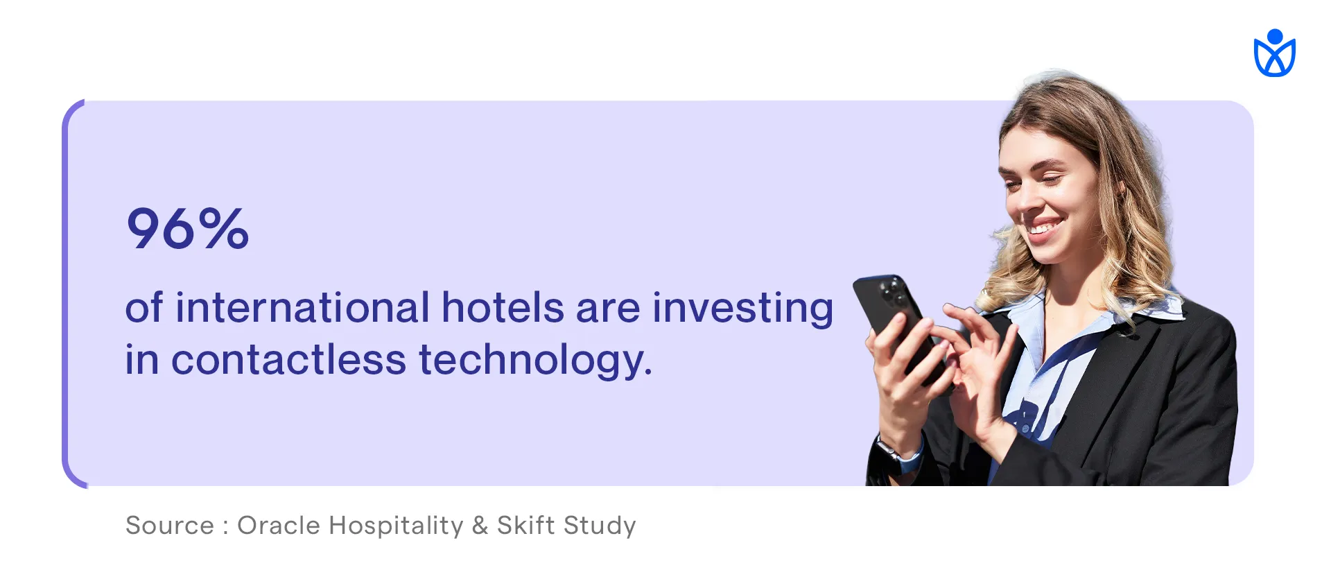
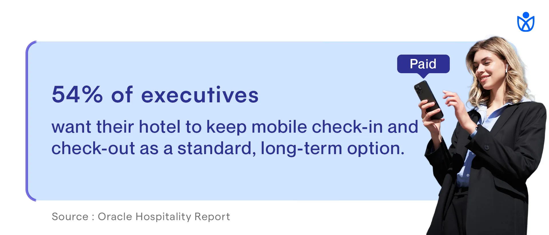
Here's the truth: hotel leadership is paying attention to digital check-in like never before. According to research from Oracle, 54% of hotel executives have identified improving or eliminating the front desk experience through mobile check-in and check-out as their highest technology priority through 2025. That's more than half the industry actively investing in this right now.
The same research shows that 71% of guests are more likely to book with hotels offering self-service check-in options. This isn't a nice-to-have anymore. Guest expectations have shifted. They expect it.
Hotels that don't offer digital check-in aren't just behind. They're actively turning away guests who prefer modern arrivals.
If you're still primarily operating on paper check-in and lines at the front desk, you're competing with one hand tied behind your back. Your competitors who have sorted out digital check-in are capturing market share from you right now.
Here's the structure I'm about to show you. But first, remember: your timing target is 90 to 120 seconds total. This breaks down roughly as:
Step 1 (verification): 15 to 20 seconds
Step 2 (ID and payment): 30 to 40 seconds
Step 3 (preferences and upsells): 20 to 30 seconds
Step 4 (confirmation): 15 to 20 seconds
Total: 90 to 120 seconds from start to room ready.
This is achievable. It requires discipline. Every field has to justify its presence.
Your guest lands on the check-in page. The first screen should take 15 to 20 seconds maximum.
What to show: A single input field requesting the booking reference number or phone number A welcoming message: "Welcome! Let's get you checked in." A progress indicator showing "Step 1 of 4"
What to avoid: Logo and branding that takes up half the screen Terms and conditions on the first page Multiple input options (yes, let them choose between booking reference or phone, but make it one field)
Why this works: Guests land on a single-purpose screen. No confusion. No cognitive overload. They see what to do immediately and do it.
The booking reference comes from their confirmation email. They probably have it open or can find it in seconds. If they give you their phone number instead, your system does a quick database lookup and confirms the reservation.
Time check: This step should take 10 to 15 seconds if you've pre-loaded the page correctly.
This is the longest step. It includes two required pieces:
Identity verification: Request a photo ID. Use your camera to capture it or let guests upload from their phone. Offer both options. Include a helpful instruction: "Take a photo of the front of your ID. Keep the image clear and well-lit."
Payment method: Request a credit card for incidental charges or pre-authorization. PCI-compliant payment fields are critical here. Use a trusted payment processor with built-in security.
What makes this faster: Pre-fill the cardholder name if you already have it. Guests just need to enter the card number, expiration, and CVV. No address needed at this stage.
Show expected charges clearly. A single line saying "Incidentals authorization: $150 hold" prevents surprises and reduces support calls.
What to avoid: Asking guests to fill out billing address, phone number, email again. You already have this.
Asking for the CVV and then asking for it again later. Collect it once and use it.
Time check: This step takes 25 to 35 seconds with clean design and pre-filled data.
This is where you add revenue without adding friction.
Guest preference questions: High floor or low floor (optional) Room view preference (optional) Any special requests (optional text field)
Smart upsells (not aggressive selling): Room upgrade option (show price clearly) Late checkout (show price clearly) Parking or parking upgrade if applicable Package add-ons (breakfast, spa credit, activity package)
Why this timing works: Guests can skip these sections. They're optional. A guest who wants their room quickly can tab through this in 10 seconds. A guest willing to spend 30 seconds here might buy an upgrade.
How to present upsells without friction: Use cards or toggles, not aggressive promotional language. Example: "Upgrade to deluxe suite - $45" instead of "Transform your stay."
Show the price immediately. Never hide cost until the end.
Let guests say no with a single tap. No multiple follow-up screens.
Time check: This step takes 15 to 25 seconds without upsells, 25 to 40 seconds if guests explore upgrades. Both are acceptable.
The final screen is the most important. This single screen prevents 40% of post-check-in support calls.
What to show: Guest name Room number Check-in and check-out dates Check-out time Key access method (mobile key, PIN code, or "keys available at front desk") WiFi name and password Immediate next steps (go to your room, link is on this screen to housekeeping if room isn't ready, escalation path if something is wrong)
What to include as action buttons: "Got It" or "I'm Heading to My Room" button (takes them to digital key or foyer map) "Need Help?" button (escalates to live chat or front desk)
Time check: 15 to 20 seconds to read and absorb.
Let's walk through a real scenario. Meet Sarah.
Sarah booked a hotel for a work trip. She arrives at 2 PM on a Tuesday. The lobby is busy. She doesn't want to wait.
She gets an SMS 24 hours before arrival saying "Your check-in link is ready. Check in from your phone and skip the line." She taps the link at 1:45 PM from the airport.
The screen shows a single field: "Enter your booking reference or phone number."
She types her booking reference (takes 10 seconds).
Next screen loads. It says "Welcome, Sarah. One more step to get your room access."
A photo ID field appears. She takes a quick photo of her driver's license with her camera (20 seconds).
A payment field appears. Her card number from the previous booking is already filled in. She just confirms the expiration and CVV (10 seconds).
Next page. "Room preferences?" She selects "high floor" and clicks the room upgrade option. Sees it's $45. Decides not to take it today. Moves forward (15 seconds).
Final confirmation screen. Room 1204. Check-out time is 11 AM. Her mobile key is already activated in her digital wallet. WiFi password is displayed.
Total time from click to room-ready: 92 seconds.
She walks to the elevator. Front desk never saw her. No wait. No paperwork. No friction.
The 4-step structure works on any platform, but your technology stack matters. If you're evaluating digital check-in solutions make sure your platform handles the pieces Sarah just went through:
Pre-arrival messaging integration (SMS, email, WhatsApp) Real-time PMS integration for guest data Payment processing (PCI-compliant tokenized cards) Mobile key distribution, Analytics tracking (step-by-step abandonment rates)
The best digital check-in solutions integrate all of these seamlessly. Some hotels try to build check-in flows using disconnected tools and it falls apart. Your SMS platform doesn't talk to your PMS. Your payment processor doesn't sync with your locks. Guests have a terrible experience.
Look for platforms that handle end-to-end check-in, not point solutions. When you're evaluating options, Guestara's digital check-in module and other enterprise solutions provide this integrated approach. If you want to see what's available in the market, our guide to the 15 best hotel check-in software in 2025 compares solutions across features, pricing, and integration capabilities to help you identify what fits your property.
Let's talk data. This matters because it shows why every field you include has a cost.
Industry baseline: 28% of guests complete online check-in.
Hotels with well-designed flows: 50% to 70% completion.
The difference? Not technology. Design.
A daily improvement in completion rate from 28% to 50% means:
For a 150-room hotel at 70% occupancy: 105 occupied rooms per night.
28% of 105 = 29 guests checking in digitally today. 50% of 105 = 53 guests checking in digitally today.
That's 24 additional guests bypassing the front desk.
At an average of 8 minutes saved per guest in front desk time, that's 192 minutes or 3.2 hours of front desk time freed up per day. Over a year, that's 1,160 hours of labor you can redirect to service, cleaning, or guest recovery.
Financial value: A front desk associate costs roughly $16 to $20 per hour including benefits. Redirecting 1,160 hours annually = $18,560 to $23,200 in labor value annually.
That's just operational efficiency. You haven't even counted revenue from upsells during check-in.
Hotels report 15% to 20% additional revenue during mobile check-in from upsells. The completion-rate gap between poorly designed and well-designed flows costs hotels real money.
H2: Pre-Arrival Messaging: The Hidden Weapon for Adoption
Here's something most hotels miss. Your digital check-in flow starts before the guest ever sees it.
The check-in invitation message determines whether guests use your system.
Test this language:
Bad invitation: "Complete your hotel check-in online at [link]."
This is generic. The guest doesn't know why they should. They don't know it saves time.
Good invitation: "Skip the front desk line. Check in from your phone in 2 minutes. Tap below."
This tells the guest the benefit (skip the line), the time investment (2 minutes), and the action (tap).
Better invitation (with proof): "Over 70% of our guests now skip the front desk and check in from their phone. Takes 2 minutes. Your key and room number wait for you. [Tap to Check In]"
The third option works because it gives social proof, sets expectations, and makes the action clear.
Timing also matters. Send the check-in invitation 24 to 48 hours before arrival. This gives guests time to prepare. Sending it too early and they forget the link. Sending it too late and they're already at the front desk.
A/B test your messaging. Track completion rates against invitation language. You might find that one message gets 60% completion while another gets 40% completion. Same system. Different language.
If you want to explore how to boost guest adoption of mobile check-in beyond messaging alone, we have a detailed guide covering five evidence-based strategies that show you exactly how to increase adoption rates and completion. The guide includes messaging templates, timing recommendations, and what other hotels are testing right now.
You now understand the flow structure. But why do some hotels see 70% completion and others see 30% despite using similar systems?
Here are the levers that actually move completion:
These aren't suggestions. These are multipliers. If your system is missing three of these levers, you're probably at 28% completion (industry standard). Every lever you pull moves you closer to 50% or higher.
The best hotels use all eight. That's why they hit 70%.
Design is half the battle. The other half is technology.
Your digital check-in system must integrate with:
Property Management System (PMS): Real-time, two-way integration. When a guest checks in via mobile, their status should update in your PMS immediately. When housekeeping marks a room clean, the guest should get a "Room Ready" notification.
Payment gateway: PCI-compliant payment processing. Don't store card numbers yourself. Use a tokenized payment processor. Guests expect security. Don't disappoint them.
Smart locks or mobile key system:The guest's phone becomes their key. They don't need a physical key card. This eliminates lost keys and forgotten keys.
Messaging platform: SMS or WhatsApp integration for sending check-in invitations, confirmations, and support escalations. Email is fine but SMS has 98% open rates while email averages 25%.
Analytics: Your system should track: Completion rate Abandonment rate (where guests drop off) Time per step Device type (iOS vs Android vs desktop) Conversion rate on upsells
Without analytics, you're flying blind. You don't know which step is causing dropoffs. You don't know if your new language test improved completion.
Before we wrap up, here are the mistakes that kill digital check-in adoption:
Asking for information twice. Never ask for a guest's phone number, email, or address twice on the same form. Pre-fill or ask once.
Not pre-filling anything. If you have a guest's reservation, use it. Pre-fill their name, email, phone, address if you have it. Make them re-enter nothing.
Burying the progress indicator. If guests don't know how many steps are left, they feel lost. Show progress at every step.
Using industry jargon or unclear labels. Instead of "Billing Address," say "Where should we send your invoice?" Instead of "Incidentals Authorization," say "We'll place a hold for extra charges."
Making the payment field feel unsafe. Use recognizable payment brand logos (Visa, Mastercard). Show security badges. Tell guests "Your payment is encrypted" if your system supports it.
Not offering fallback options. Some guests won't use mobile check-in. Have a QR code option for kiosks. Have a link for email access. Have a phone number for voice-based check-in if needed.
Upselling aggressively. A single "Would you like to upgrade?" is good. Three screens of upgrade options will make guests abandon the system.
No support option. If a guest gets stuck and can't contact anyone, they'll call the front desk and defeat the purpose of the system. Include a "Need Help?" button that connects to live chat or a phone number.
You launch your 2-minute check-in flow. Now what?
Track these metrics weekly:
Completion rate: What percentage of guests who receive a check-in invitation actually complete it?
Average time to completion: Are you hitting 90 to 120 seconds? If not, where's the friction?
Abandonment rate by step: Where do guests drop off? If half your guests abandon on Step 2, your ID verification process is the problem.
Mobile vs desktop completion: Are mobile users (70% of traffic) completing at higher or lower rates than desktop? If mobile is low, your responsive design needs work.
Pre-arrival message open rate: What percentage of guests who get the check-in invitation actually open it? Low open rates mean your messaging, timing, or delivery channel (SMS vs email) needs adjustment.
Upsell conversion rate during check-in: What percentage of guests see an upgrade offer and accept it? This tells you if your upselling strategy is working or being ignored.
Front desk check-in volume: Has your digital adoption reduced front desk check-in workload? This is the operational win.
Guest satisfaction score (pre-arrival, arrival, overall stay): Has digital check-in improved satisfaction? It should. If it hasn't, the experience is too clunky.
These metrics form your North Star. If completion drops, dig into abandonment rate by step. If upsell conversion is low, test different offers. If mobile completion lags, check your page load time on mobile.
If you want to go deeper than just the flow design, there's a complete guide to contactless check-in at hotels that covers the full implementation picture. It walks through technology selection, staff training, guest communication, and how to handle edge cases. It's worth reading if you're building out a complete check-in system rather than just redesigning your flow.
A 180-room boutique hotel in a urban market was stuck at 31% digital check-in completion. Their system was solid. The problem was design.
They ran an audit:
Results after two weeks of these changes:
Completion rate jumped from 31% to 58%.
Average check-in time dropped from 4 minutes 12 seconds to 1 minute 58 seconds.
Front desk check-in volume dropped by 52%. That's half the guests skipping the desk.
Upsell conversions jumped from 3% to 12%. Guests weren't abandoning the form, so they now saw upsell offers.
They spent zero dollars on new technology. They redesigned what they had.
You've got the blueprint. Here's how to implement it:
Week 1: Audit Review your current check-in flow. Count the form fields. Time yourself going through it. Track where you drop off or get confused. This is your baseline.
Identify which of the 8 UX checklist items you're missing. Are you pre-filling data? Is it mobile-optimized? Does it load fast?
Week 2: Redesign the Flow Map your 4-step structure using the framework in this guide. Decide which fields are legally required vs nice-to-have. Cut the nice-to-haves.
Design Step 1 to ask for one thing: booking reference or phone number.
Design Step 2 to collect ID and payment only.
Design Step 3 to offer preferences and upsells.
Design Step 4 as the confirmation screen with room number, access method, and next steps.
Week 3: Test Messaging Write three versions of your pre-arrival check-in invitation. Test language A with 1,000 guests. Language B with 1,000 guests. Language C with 1,000 guests.
Measure completion rates. The winner becomes your standard.
Week 4: Launch and Measure Push your redesigned flow live. Start tracking the metrics listed above. Measure weekly.
Week 5+: Iterate Small improvements compound. If completion is 60%, test different upsell offers. If mobile completion lags, optimize page load time. If a specific step has high abandonment, redesign that step.
Here's the real reason to care about digital check-in design.
A guest's first impression of your hotel isn't the lobby. It's the check-in experience.
If they're stressed, waiting in a line, filling out forms, they're already frustrated before they see their room.
If they check in from their phone in 2 minutes, they walk in feeling smart. They feel like the hotel gets modern travelers. They feel welcomed.
That feeling sticks with them. It shows up in your guest satisfaction scores. It shows up in repeat bookings. It shows up in reviews.
The best hotels aren't just faster. They make guests feel like the hotel was designed for them.
A 2-minute check-in flow does that.
If you want to see how this 2-minute flow integrates into a complete guest experience platform, Guestara provides a live demonstration of how digital check-in works alongside unified messaging, guest directories, and upselling. When check-in is part of a larger guest experience system, not a standalone tool, you see much better results across adoption and guest satisfaction.
Visit Guestara to see how digital check-in fits into the bigger picture of your guest journey.
Take this guide and audit your property this week.
Count your form fields. Compare them to the structure outlined here.
Time your check-in flow. Is it approaching 2 minutes?
Review your pre-arrival messaging. Does it tell guests why they should use digital check-in?
Identify one thing you can improve this month. Maybe it's cutting form fields. Maybe it's pre-filling data. Maybe it's improving messaging.
Start small. Measure the impact. Iterate.
The hotels hitting 70% digital check-in completion didn't get there overnight. They got there by continuously optimizing one element at a time.
Your system is probably capable of more than it's currently delivering. It just needs the right design.
Start this week.
Your guests are waiting. They want in.
The hotel that respects their time wins their loyalty.
Build a 2-minute check-in flow. Track your results. Iterate weekly.
You'll hit 60% adoption within a month. 70% within two months.
And when you do, you'll free up 3+ hours of daily front desk time while capturing 15% to 20% in incremental upsell revenue.
That's the payoff.
Now go design something guests actually want to use.
Industry baseline is 28% completion. Hotels with optimized designs (minimal form fields, mobile-first, pre-filled data) achieve 50-70% completion. The difference comes from design strategy, not better technology.
Optimal duration is 90-120 seconds. Traditional check-in averages 8-12 minutes. Two-minute flows using pre-filled data and minimal required fields consistently hit 70% completion rates across hotel properties.
Only ask for three essentials: booking reference, government ID (legally required), and payment method for incidentals. Skip optional fields like billing address if already captured during booking. Each extra field reduces completion rate by 2-5%.
Web-based check-in converts significantly higher. Requiring app downloads cuts adoption by 40-50%. Responsive web design (creating an app-like feel) achieves 10-15% better completion rates without download friction or installation barriers.
Hotels typically capture 15-20% additional revenue from check-in upsells (room upgrades, late checkout, packages). Higher completion rates unlock this revenue guests who abandon the form never see upgrade offers, missing revenue opportunities.
We work closely with the industry leaders to offer seamless solutions


We’re here to help your whole team stay ahead of the curve as you grow.

Get up and running quickly with a personalized onboarding plan

Connect with real people who really get it, 24/7

Checkout our vast library of fee resources, templates and more
There's only so much we can say — so let us show you! Schedule a demo today and reach your business goals.