Design accessible digital check-in for older guests. Assisted flows, lobby signage scripts, staff training guides, and real conversion data from hotels like yours.

Your digital check-in system is beautiful. Modern. Fast.
But when an older guest walks into your lobby, they don't see an opportunity. They see a problem.
They don't know where to start. The screen text is too small. They're uncomfortable with touchscreens. They're frustrated after a long journey. So they walk straight to the front desk, bypassing your entire system.
This happens at thousands of hotels every single day.
The problem isn't that older guests don't want to use technology. It's that most digital check-in flows are designed for 30-year-old tech-savvy travelers. They're not designed for the fastest-growing guest demographic: older travelers who value comfort, accessibility, and a human touch.
Here's what matters: Older travelers book longer stays, spend more per night, and have higher guest satisfaction when they feel welcomed. They're not abandoning your digital system because they're anti-technology. They're abandoning it because it wasn't designed with them in mind.
This guide shows you exactly how to build accessible digital check-in flows, create clear lobby signage that guides all guests, and train your staff to assist guests who need help. The result: completion rates jump from 28% industry-wide to 60%+ across all guest demographics.
If you're struggling with adoption rates among diverse guest groups,our guide on how to boost guest adoption with mobile check-in covers proven strategies beyond just accessible design.
Let's be honest about what happens in most hotel lobbies.
A guest arrives. Your beautiful kiosk sits in the corner with clear signage. But the guest doesn't use it. Why? Three reasons:
The result: They go to the front desk, creating bottlenecks, slowing down operations, and increasing labor costs.
But here's the real cost: You're leaving revenue on the table. Guests who feel welcomed and respected during check-in spend more on upsells, book longer stays, and leave better reviews.
The hospitality industry is waking up to this. Hotels are increasingly recognizing that accessibility isn't a nice-to-have. It's a competitive necessity. Guest demographics are shifting. Baby Boomers and older travelers represent a significant portion of hotel bookings, and they're choosing properties that respect their needs.
Before redesigning your check-in experience, understand who's arriving at your desk.
The "Silver Society" travelers age 55 and above prioritizes comfort, accessibility, and quality over price. They book longer stays. They travel in multi-generational groups (families with grandparents). They're not price-shopping on OTAs. They're calling properties directly or booking through travel agents who know them.
These guests aren't anti-technology. They text. They use email. Many use smartphones daily. But they approach new interfaces with caution. They want clear instructions. They want assurance that their data is safe. They want to know there's a human available if something goes wrong.
More important: These guests have different physical needs. Vision changes with age. Fine motor control matters. Hearing changes affect how you deliver instructions. Some guests have mobility limitations. Some have cognitive needs that require clear, simple communication without jargon.
Your check-in system doesn't need to be different for older guests. It needs to be accessible for everyone. And when you do that, completion rates improve across all age groups.
Here's the honest truth: You don't replace the front desk with digital check-in. You complement it.
The most successful hotels use a hybrid approach:
Digital self-service for guests who want it and can use it (younger tech-savvy travelers, business guests)
Kiosk check-in for guests who want some assistance but prefer not to wait in a line (middle-ground guests)
Assisted digital check-in at the front desk for guests who need help (older guests, non-native speakers, guests with accessibility needs)
Paper check-in as a fallback for technology failures (backup for everyone)
This isn't admitting defeat. It's recognizing guest diversity and respecting choice. When guests feel they have options, completion rates jump. They choose the method that works for them.
Data from hotel technology reports shows that properties offering multiple check-in methods see:
The hybrid model works because it removes judgment. A guest doesn't feel pressured to use a kiosk if they're not comfortable. They can choose. And when you give guests choice, they're happier.
If you want to understand the full range of contactless options available today, our complete guide to contactless check-in hotel walks through technology options, implementation strategy, and how to choose what's right for your property.
If you're redesigning your digital check-in or selecting a platform, run it against these five accessibility standards. These aren't optional. They're the baseline for modern hospitality.
Older guests often have vision changes. Small text isn't just inconvenient. It's exclusionary.
What to do: Text must be at minimum 16px font size (not 12px like many interfaces use) High contrast between text and background (black on white, not gray on gray) Sans-serif fonts (Arial, Helvetica, Verdana) are easier to read than serif fonts No all-caps text (mixed case is easier to read than blocks of capitals) Line height should be 1.5 (text shouldn't be cramped)
Test it yourself. Open your current check-in flow on a phone. Hold it at arm's length. Can you read every word without squinting? If not, your older guests can't either.
Older guests and those with arthritis need larger touch targets.
What to do: Buttons must be minimum 44x44 pixels (not 30x30) Form field text boxes should be easy to tap and type in Space between buttons so accidental mis-taps are avoided Don't require precision touches or fast tapping
Test this too. Tap a button with your thumb while holding a phone in one hand. If it's difficult for you, it's nearly impossible for someone with reduced hand dexterity.
Your PMS language isn't guest language.
What to do: Avoid terms like "incidentals authorization" (say "security hold on your card" instead) Avoid terms like "digital key" (say "phone as room key" instead) Use short sentences. One idea per line. Explain what happens next. "Swipe your ID. We'll take a photo and verify your identity. It takes 30 seconds." Never use abbreviations without explaining them first
Not every guest can use a touchscreen comfortably.
What to do: Ensure your system works if keyboard tabbing is the only input method Consider voice control options for guests who prefer speaking over typing Make sure focus indicators are visible (guests know where they are on the form) Support browser zoom so guests can enlarge text
Some hotels are adding voice assistant compatibility. A guest could say "Check me in" and the system walks them through the process verbally. This opens check-in to guests who can't use touchscreens.
Older guests get anxious about whether they're doing it right.
What to do: Show progress constantly ("Step 2 of 4") Allow guests to go back to previous steps Have a visible "Get Help" or "Speak to Staff" button at every step Tell guests what happens next ("After this step, we'll assign your room and send it to your phone") Never trap a guest in a form with no way out
Here's where many hotels fail: They create a beautiful digital system, then force older guests through it without help.
The solution: Assisted digital check-in. A staff member sits with the guest at a tablet and walks them through the process.
This isn't the old check-in. It's not "let me type for you." It's you holding the tablet, the guest holding your hand, and you explaining each step as you go.
Why this works:
Here's what the flow looks like:
Step 1: The Welcome (15 seconds) Staff: "Welcome to [Hotel]. Let me get you checked in on our tablet so you can get to your room faster." Guest sees: Your name, reservation dates, room type appear automatically.
Step 2: ID Verification (30 seconds) Staff: "I'm going to take a quick photo of your driver's license for our records." Staff holds up phone camera. Guest shows ID. Photo is captured automatically.
Step 3: Payment (20 seconds) Staff: "I have your card on file from your reservation. This is just a security hold for incidentals—items you might charge to your room. It'll be released after you check out." Guest sees the exact hold amount.
Step 4: Preferences (15 seconds) Staff: "Would you like a high floor or low floor?" If guest wants upsells: "We have a nice room upgrade available. It's $45 more per night. Would you like to see a picture?"
Step 5: Confirmation (20 seconds) Staff: "You're all set. You're in room 1204. Check-out is 11 AM. Your key is on your phone, or we'll have a physical key at the desk. Any questions?"
Total time: 100 seconds. Guest feels welcomed. Data is accurate. You've upsold them. They're happy.
Most hotels have confusing lobby signage. "Kiosk Check-In" and a pointer to a tablet. That's it.
Older guests don't know if they should use the kiosk. They don't know what it will ask. They don't know what happens if they get stuck.
Here are exact scripts and signage strategies that work:
Headline Sign (Above Check-In Area):
CHOOSE YOUR CHECK-IN METHOD
Quick. Easy. Your Way.
Three Directional Signs with Photos:
Sign A - Pointing to Kiosk: QUICK CHECK-IN Use our tablet. 3 steps. 2 minutes. Staff available to help.
Sign B - Pointing to Front Desk: HANDS-ON CHECK-IN Chat with our team. We'll handle everything. No experience needed.
Sign C - Pointing to Digital Option: PHONE CHECK-IN Already started? We sent you a link. Finish from your phone.
Why this works: You're giving guests choice without judgment. No guest feels forced to use technology.
Large Welcoming Sign at Entrance:
WELCOME TO [HOTEL NAME]
New! Faster Check-In Options
1. Start from home (link in your confirmation email)
2. Use the tablet in our lobby (2 minutes)
3. Check in with our team (traditional, no wait)
Pick what works for you.
At Kiosk (on the screen itself):
HELLO!
Let's get you checked in.
This takes 2-3 minutes.
If you need help at any point,
a staff member is right here.
Just wave and say "I need help."
At Front Desk:
CHECK-IN OPTIONS FOR YOUR COMFORT
Prefer to speak with someone?
We're here. No wait. Our team will guide you.
Comfortable with tablets?
Our simplified check-in takes 2 minutes.
Want to use your phone?
Check in from the lobby or your room.
Everything is fine.
Choose what feels right.
Why specific language matters:
Your staff is the difference between a guest feeling welcomed or feeling like a burden.
Here are exact scripts to train your team on assisted check-in:
Bad: "Do you need help checking in?"
Why: Guest feels judged. They feel like they're doing it wrong.
Good: "Welcome to [Hotel]. I'm [Name]. I'm going to help you check in using our tablet, okay?"
Why: You're taking initiative. You're framing it as help, not correction. You're establishing rapport.
Bad: "I'll need to collect your incidentals authorization and process your registration form."
Why: Jargon. Scary. Sounds official and cold.
Good: "I'm going to do three things. First, I'll take a photo of your ID for our records. Second, I'll show you the total on your card—that's a temporary hold for room charges. Third, I'll assign you a room and get you a key. It takes about two minutes. Sound good?"
Why: Clear steps. No jargon. Guest knows what to expect. You're asking permission, not issuing orders.
Bad: "Just tap there."
Why: Guest doesn't know where "there" is. Feels rushed.
Good: "See this box with the blue border? Tap inside it and you'll type your address. Take your time."
Why: You're pointing specifically. You're telling them what happens after. You're giving them permission to go slow.
Bad: "It's easy. Just try again."
Why: Minimizes their frustration. Makes them feel stupid.
Good: "I see why that's confusing. Let me handle this part and explain as I go."
Why: You're validating frustration. You're taking control without making them feel bad.
Bad: "You're all set."
Why: Vague. Guest doesn't know what comes next.
Good: "Perfect. You're in room 1204. Here's your key—tap this symbol on the screen. Your room is on the second floor. Just head out that door, take a left, and you'll see the elevators. Any questions?"
Why: You've given them:
Most hotels place kiosks in inconvenient locations then wonder why adoption is low.
Placement strategy:
DO place kiosks: Immediately inside the main entrance (first thing guests see) Well-lit and clearly visible from across the lobby At eye level (not too high, not requiring bending) With cushioned mats underneath (standing should be comfortable) With seating nearby (for guests who need to sit while using it) With a staff member stationed within arm's reach
DO NOT place kiosks: In dark corners High up on walls Requiring guests to navigate around furniture In noisy areas (guests can't hear instructions if you're adding audio) Without clear signage
Signage on the kiosk itself:
Top of Kiosk Sign:
CHECK IN HERE
Takes 2 minutes.
Help is always available.
On the Screen (First Page):
HELLO!
Welcome to [Hotel Name].
We're going to check you in using this tablet.
This takes about 2 minutes.
If you need help, our staff is right here.
Press START →
If a Guest Gets Stuck:
NEED HELP?
Don't worry.
Our staff member is standing
right here.
Just ask for help.
There's no rush.
Let's talk about why this matters beyond philosophy.
Hotels with accessible digital check-in see:
One hotel chain tested this. They added accessibility features to their kiosk (larger text, simpler language, assisted check-in option at desk):
Before: 31% of guests used digital check-in. Average rating: 3.8 stars. 67% mentioned check-in in reviews (mostly negative).
After (6 months): 52% of guests used some form of digital check-in (kiosk, phone, assisted). Average rating: 4.3 stars. Only 23% mentioned check-in in reviews (mostly positive).
What changed? Language. Signage. Staff training. Accessibility. Same technology. Different approach.
The business impact: Multi-night stays increased by 18% (guests who felt welcomed booked longer). Ancillary revenue increased 12% (guests completing check-in bought upgrades). Staff turnover decreased 9% (front desk felt less overwhelmed).
That's not fluffy hospitality. That's revenue.
Not every guest needs the same approach. Here's how to recognize what each guest needs:
Offer Assisted Digital Check-In to: Guests who appear confused or uncertain at the kiosk Guests age 60+ (not all, but offer it) Guests with mobility limitations Guests who ask for help Guests who approach the front desk directly (assume they want human interaction)
Encourage Kiosk Check-In to: Guests who seem tech-comfortable Guests under 45 Guests checking in during off-peak hours (you have staff available if needed) Guests who've already received a digital check-in link
Offer Traditional Paper Check-In to: Guests who've tried digital and gotten stuck Technology failure scenarios (as backup) Guests who explicitly ask for paper Guests from countries where digital isn't common
The key: Don't assume. Offer options. Let guests choose.
A 120-room boutique hotel in a city center wasn't reaching their target on digital adoption. Their problem: 42% of guests were age 55+, but only 18% of those used digital check-in.
They diagnosed the issue: No signage. Confusing kiosk experience. Staff said "the kiosk is over there" when guests asked how to check in.
They made four changes:
Results after 8 weeks:
Here's a business perspective that might surprise you:
Older guests aren't a niche segment you need to accommodate. They're a growing market with higher value.
Multi-generational travel is booming. A grandparent booking a family reunion might stay 4 nights with 8 family members. That's one guest driving 8 room-nights of revenue. That's upsells across the family. That's a group booking that scales.
Older guests book longer stays (average 3.2 nights vs. 2.1 nights for young travelers). They spend more on ancillary services (spa, dining, activities). They're more likely to be loyal (book the same hotel multiple times). They trust travel agents and word-of-mouth more than app reviews (a good experience translates to direct bookings).
A hotel that embraces older guests doesn't just feel good. It prints money.
Accessibility isn't a feature. It's a philosophy.
Hotels that nail this make accessibility part of their brand. Not as an afterthought. As a core value.
This means:
What this looks like in practice:
A guest arrives. A staff member greets them by name. "Welcome, Mrs. Johnson. I see you're traveling with your grandkids. Let's get you all checked in comfortably. I can help with our tablet, or we can do it the traditional way. What works best for you?"
No judgment. No pressure. Just respect.
That guest leaves a 5-star review. She books again. She tells her friends.
That's the payoff.
Digital check-in was never supposed to exclude anyone.
It was supposed to make things easier. Faster. More convenient.
But when a guest who's traveled the world for 60 years walks into your lobby and can't figure out how to check into a hotel, something's broken.
Not with them. With us.
The solution isn't to eliminate older guests. It's to remember that hospitality means everyone.
Start this week.
Update your signage. Train your staff. Make assistance visible and accessible.
You'll see completion rates jump. You'll see guest satisfaction rise. You'll see older guests actually using your system.
Because technology isn't supposed to replace hospitality. It's supposed to enhance it.
And that works best when everyone feels welcome.


Design accessible digital check-in for older guests. Assisted flows, lobby signage scripts, staff training guides, and real conversion data from hotels like yours.
Your digital check-in system is beautiful. Modern. Fast.
But when an older guest walks into your lobby, they don't see an opportunity. They see a problem.
They don't know where to start. The screen text is too small. They're uncomfortable with touchscreens. They're frustrated after a long journey. So they walk straight to the front desk, bypassing your entire system.
This happens at thousands of hotels every single day.
The problem isn't that older guests don't want to use technology. It's that most digital check-in flows are designed for 30-year-old tech-savvy travelers. They're not designed for the fastest-growing guest demographic: older travelers who value comfort, accessibility, and a human touch.
Here's what matters: Older travelers book longer stays, spend more per night, and have higher guest satisfaction when they feel welcomed. They're not abandoning your digital system because they're anti-technology. They're abandoning it because it wasn't designed with them in mind.
This guide shows you exactly how to build accessible digital check-in flows, create clear lobby signage that guides all guests, and train your staff to assist guests who need help. The result: completion rates jump from 28% industry-wide to 60%+ across all guest demographics.
If you're struggling with adoption rates among diverse guest groups,our guide on how to boost guest adoption with mobile check-in covers proven strategies beyond just accessible design.
Let's be honest about what happens in most hotel lobbies.
A guest arrives. Your beautiful kiosk sits in the corner with clear signage. But the guest doesn't use it. Why? Three reasons:
The result: They go to the front desk, creating bottlenecks, slowing down operations, and increasing labor costs.
But here's the real cost: You're leaving revenue on the table. Guests who feel welcomed and respected during check-in spend more on upsells, book longer stays, and leave better reviews.
The hospitality industry is waking up to this. Hotels are increasingly recognizing that accessibility isn't a nice-to-have. It's a competitive necessity. Guest demographics are shifting. Baby Boomers and older travelers represent a significant portion of hotel bookings, and they're choosing properties that respect their needs.
Before redesigning your check-in experience, understand who's arriving at your desk.
The "Silver Society" travelers age 55 and above prioritizes comfort, accessibility, and quality over price. They book longer stays. They travel in multi-generational groups (families with grandparents). They're not price-shopping on OTAs. They're calling properties directly or booking through travel agents who know them.
These guests aren't anti-technology. They text. They use email. Many use smartphones daily. But they approach new interfaces with caution. They want clear instructions. They want assurance that their data is safe. They want to know there's a human available if something goes wrong.
More important: These guests have different physical needs. Vision changes with age. Fine motor control matters. Hearing changes affect how you deliver instructions. Some guests have mobility limitations. Some have cognitive needs that require clear, simple communication without jargon.
Your check-in system doesn't need to be different for older guests. It needs to be accessible for everyone. And when you do that, completion rates improve across all age groups.
Here's the honest truth: You don't replace the front desk with digital check-in. You complement it.
The most successful hotels use a hybrid approach:
Digital self-service for guests who want it and can use it (younger tech-savvy travelers, business guests)
Kiosk check-in for guests who want some assistance but prefer not to wait in a line (middle-ground guests)
Assisted digital check-in at the front desk for guests who need help (older guests, non-native speakers, guests with accessibility needs)
Paper check-in as a fallback for technology failures (backup for everyone)
This isn't admitting defeat. It's recognizing guest diversity and respecting choice. When guests feel they have options, completion rates jump. They choose the method that works for them.
Data from hotel technology reports shows that properties offering multiple check-in methods see:
The hybrid model works because it removes judgment. A guest doesn't feel pressured to use a kiosk if they're not comfortable. They can choose. And when you give guests choice, they're happier.
If you want to understand the full range of contactless options available today, our complete guide to contactless check-in hotel walks through technology options, implementation strategy, and how to choose what's right for your property.
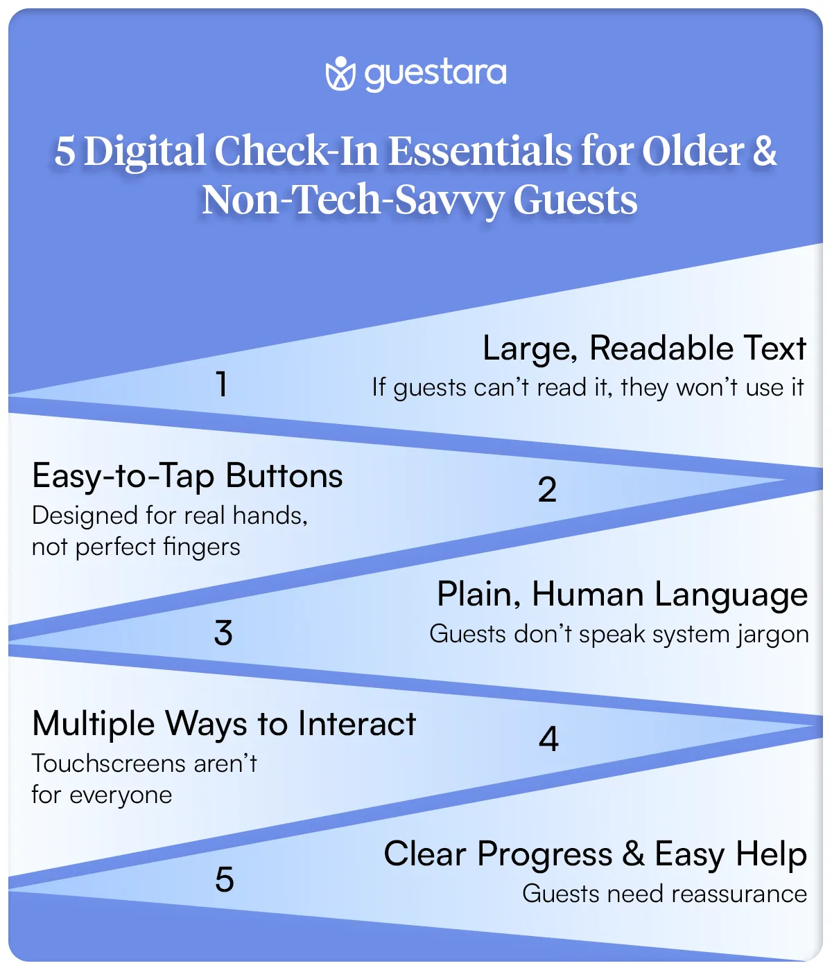
If you're redesigning your digital check-in or selecting a platform, run it against these five accessibility standards. These aren't optional. They're the baseline for modern hospitality.
Older guests often have vision changes. Small text isn't just inconvenient. It's exclusionary.
What to do: Text must be at minimum 16px font size (not 12px like many interfaces use) High contrast between text and background (black on white, not gray on gray) Sans-serif fonts (Arial, Helvetica, Verdana) are easier to read than serif fonts No all-caps text (mixed case is easier to read than blocks of capitals) Line height should be 1.5 (text shouldn't be cramped)
Test it yourself. Open your current check-in flow on a phone. Hold it at arm's length. Can you read every word without squinting? If not, your older guests can't either.
Older guests and those with arthritis need larger touch targets.
What to do: Buttons must be minimum 44x44 pixels (not 30x30) Form field text boxes should be easy to tap and type in Space between buttons so accidental mis-taps are avoided Don't require precision touches or fast tapping
Test this too. Tap a button with your thumb while holding a phone in one hand. If it's difficult for you, it's nearly impossible for someone with reduced hand dexterity.
Your PMS language isn't guest language.
What to do: Avoid terms like "incidentals authorization" (say "security hold on your card" instead) Avoid terms like "digital key" (say "phone as room key" instead) Use short sentences. One idea per line. Explain what happens next. "Swipe your ID. We'll take a photo and verify your identity. It takes 30 seconds." Never use abbreviations without explaining them first
Not every guest can use a touchscreen comfortably.
What to do: Ensure your system works if keyboard tabbing is the only input method Consider voice control options for guests who prefer speaking over typing Make sure focus indicators are visible (guests know where they are on the form) Support browser zoom so guests can enlarge text
Some hotels are adding voice assistant compatibility. A guest could say "Check me in" and the system walks them through the process verbally. This opens check-in to guests who can't use touchscreens.
Older guests get anxious about whether they're doing it right.
What to do: Show progress constantly ("Step 2 of 4") Allow guests to go back to previous steps Have a visible "Get Help" or "Speak to Staff" button at every step Tell guests what happens next ("After this step, we'll assign your room and send it to your phone") Never trap a guest in a form with no way out
Here's where many hotels fail: They create a beautiful digital system, then force older guests through it without help.
The solution: Assisted digital check-in. A staff member sits with the guest at a tablet and walks them through the process.
This isn't the old check-in. It's not "let me type for you." It's you holding the tablet, the guest holding your hand, and you explaining each step as you go.
Why this works:
Here's what the flow looks like:
Step 1: The Welcome (15 seconds) Staff: "Welcome to [Hotel]. Let me get you checked in on our tablet so you can get to your room faster." Guest sees: Your name, reservation dates, room type appear automatically.
Step 2: ID Verification (30 seconds) Staff: "I'm going to take a quick photo of your driver's license for our records." Staff holds up phone camera. Guest shows ID. Photo is captured automatically.
Step 3: Payment (20 seconds) Staff: "I have your card on file from your reservation. This is just a security hold for incidentals—items you might charge to your room. It'll be released after you check out." Guest sees the exact hold amount.
Step 4: Preferences (15 seconds) Staff: "Would you like a high floor or low floor?" If guest wants upsells: "We have a nice room upgrade available. It's $45 more per night. Would you like to see a picture?"
Step 5: Confirmation (20 seconds) Staff: "You're all set. You're in room 1204. Check-out is 11 AM. Your key is on your phone, or we'll have a physical key at the desk. Any questions?"
Total time: 100 seconds. Guest feels welcomed. Data is accurate. You've upsold them. They're happy.
Most hotels have confusing lobby signage. "Kiosk Check-In" and a pointer to a tablet. That's it.
Older guests don't know if they should use the kiosk. They don't know what it will ask. They don't know what happens if they get stuck.
Here are exact scripts and signage strategies that work:
Headline Sign (Above Check-In Area):
CHOOSE YOUR CHECK-IN METHOD
Quick. Easy. Your Way.
Three Directional Signs with Photos:
Sign A - Pointing to Kiosk: QUICK CHECK-IN Use our tablet. 3 steps. 2 minutes. Staff available to help.
Sign B - Pointing to Front Desk: HANDS-ON CHECK-IN Chat with our team. We'll handle everything. No experience needed.
Sign C - Pointing to Digital Option: PHONE CHECK-IN Already started? We sent you a link. Finish from your phone.
Why this works: You're giving guests choice without judgment. No guest feels forced to use technology.
Large Welcoming Sign at Entrance:
WELCOME TO [HOTEL NAME]
New! Faster Check-In Options
1. Start from home (link in your confirmation email)
2. Use the tablet in our lobby (2 minutes)
3. Check in with our team (traditional, no wait)
Pick what works for you.
At Kiosk (on the screen itself):
HELLO!
Let's get you checked in.
This takes 2-3 minutes.
If you need help at any point,
a staff member is right here.
Just wave and say "I need help."
At Front Desk:
CHECK-IN OPTIONS FOR YOUR COMFORT
Prefer to speak with someone?
We're here. No wait. Our team will guide you.
Comfortable with tablets?
Our simplified check-in takes 2 minutes.
Want to use your phone?
Check in from the lobby or your room.
Everything is fine.
Choose what feels right.
Why specific language matters:
Your staff is the difference between a guest feeling welcomed or feeling like a burden.
Here are exact scripts to train your team on assisted check-in:
Bad: "Do you need help checking in?"
Why: Guest feels judged. They feel like they're doing it wrong.
Good: "Welcome to [Hotel]. I'm [Name]. I'm going to help you check in using our tablet, okay?"
Why: You're taking initiative. You're framing it as help, not correction. You're establishing rapport.
Bad: "I'll need to collect your incidentals authorization and process your registration form."
Why: Jargon. Scary. Sounds official and cold.
Good: "I'm going to do three things. First, I'll take a photo of your ID for our records. Second, I'll show you the total on your card—that's a temporary hold for room charges. Third, I'll assign you a room and get you a key. It takes about two minutes. Sound good?"
Why: Clear steps. No jargon. Guest knows what to expect. You're asking permission, not issuing orders.
Bad: "Just tap there."
Why: Guest doesn't know where "there" is. Feels rushed.
Good: "See this box with the blue border? Tap inside it and you'll type your address. Take your time."
Why: You're pointing specifically. You're telling them what happens after. You're giving them permission to go slow.
Bad: "It's easy. Just try again."
Why: Minimizes their frustration. Makes them feel stupid.
Good: "I see why that's confusing. Let me handle this part and explain as I go."
Why: You're validating frustration. You're taking control without making them feel bad.
Bad: "You're all set."
Why: Vague. Guest doesn't know what comes next.
Good: "Perfect. You're in room 1204. Here's your key—tap this symbol on the screen. Your room is on the second floor. Just head out that door, take a left, and you'll see the elevators. Any questions?"
Why: You've given them:
Most hotels place kiosks in inconvenient locations then wonder why adoption is low.
Placement strategy:
DO place kiosks: Immediately inside the main entrance (first thing guests see) Well-lit and clearly visible from across the lobby At eye level (not too high, not requiring bending) With cushioned mats underneath (standing should be comfortable) With seating nearby (for guests who need to sit while using it) With a staff member stationed within arm's reach
DO NOT place kiosks: In dark corners High up on walls Requiring guests to navigate around furniture In noisy areas (guests can't hear instructions if you're adding audio) Without clear signage
Signage on the kiosk itself:
Top of Kiosk Sign:
CHECK IN HERE
Takes 2 minutes.
Help is always available.
On the Screen (First Page):
HELLO!
Welcome to [Hotel Name].
We're going to check you in using this tablet.
This takes about 2 minutes.
If you need help, our staff is right here.
Press START →
If a Guest Gets Stuck:
NEED HELP?
Don't worry.
Our staff member is standing
right here.
Just ask for help.
There's no rush.
Let's talk about why this matters beyond philosophy.
Hotels with accessible digital check-in see:
One hotel chain tested this. They added accessibility features to their kiosk (larger text, simpler language, assisted check-in option at desk):
Before: 31% of guests used digital check-in. Average rating: 3.8 stars. 67% mentioned check-in in reviews (mostly negative).
After (6 months): 52% of guests used some form of digital check-in (kiosk, phone, assisted). Average rating: 4.3 stars. Only 23% mentioned check-in in reviews (mostly positive).
What changed? Language. Signage. Staff training. Accessibility. Same technology. Different approach.
The business impact: Multi-night stays increased by 18% (guests who felt welcomed booked longer). Ancillary revenue increased 12% (guests completing check-in bought upgrades). Staff turnover decreased 9% (front desk felt less overwhelmed).
That's not fluffy hospitality. That's revenue.
Not every guest needs the same approach. Here's how to recognize what each guest needs:
Offer Assisted Digital Check-In to: Guests who appear confused or uncertain at the kiosk Guests age 60+ (not all, but offer it) Guests with mobility limitations Guests who ask for help Guests who approach the front desk directly (assume they want human interaction)
Encourage Kiosk Check-In to: Guests who seem tech-comfortable Guests under 45 Guests checking in during off-peak hours (you have staff available if needed) Guests who've already received a digital check-in link
Offer Traditional Paper Check-In to: Guests who've tried digital and gotten stuck Technology failure scenarios (as backup) Guests who explicitly ask for paper Guests from countries where digital isn't common
The key: Don't assume. Offer options. Let guests choose.
A 120-room boutique hotel in a city center wasn't reaching their target on digital adoption. Their problem: 42% of guests were age 55+, but only 18% of those used digital check-in.
They diagnosed the issue: No signage. Confusing kiosk experience. Staff said "the kiosk is over there" when guests asked how to check in.
They made four changes:
Results after 8 weeks:
Here's a business perspective that might surprise you:
Older guests aren't a niche segment you need to accommodate. They're a growing market with higher value.
Multi-generational travel is booming. A grandparent booking a family reunion might stay 4 nights with 8 family members. That's one guest driving 8 room-nights of revenue. That's upsells across the family. That's a group booking that scales.
Older guests book longer stays (average 3.2 nights vs. 2.1 nights for young travelers). They spend more on ancillary services (spa, dining, activities). They're more likely to be loyal (book the same hotel multiple times). They trust travel agents and word-of-mouth more than app reviews (a good experience translates to direct bookings).
A hotel that embraces older guests doesn't just feel good. It prints money.
Accessibility isn't a feature. It's a philosophy.
Hotels that nail this make accessibility part of their brand. Not as an afterthought. As a core value.
This means:
What this looks like in practice:
A guest arrives. A staff member greets them by name. "Welcome, Mrs. Johnson. I see you're traveling with your grandkids. Let's get you all checked in comfortably. I can help with our tablet, or we can do it the traditional way. What works best for you?"
No judgment. No pressure. Just respect.
That guest leaves a 5-star review. She books again. She tells her friends.
That's the payoff.
Digital check-in was never supposed to exclude anyone.
It was supposed to make things easier. Faster. More convenient.
But when a guest who's traveled the world for 60 years walks into your lobby and can't figure out how to check into a hotel, something's broken.
Not with them. With us.
The solution isn't to eliminate older guests. It's to remember that hospitality means everyone.
Start this week.
Update your signage. Train your staff. Make assistance visible and accessible.
You'll see completion rates jump. You'll see guest satisfaction rise. You'll see older guests actually using your system.
Because technology isn't supposed to replace hospitality. It's supposed to enhance it.
And that works best when everyone feels welcome.
Baby Boomers (age 55+) represent approximately 40-50% of leisure hotel bookings. Not all older guests are non-tech savvy, but many prefer human interaction during check-in over digital-only options. Hotels offering multiple check-in methods see 15-20% higher completion rates across all age groups.
Assisted digital check-in at the front desk takes 90-120 seconds total. A staff member walks the guest through the process step-by-step using a tablet. This is faster than paper check-in (5-7 minutes) while being more comfortable than unassisted digital check-in for guests unfamiliar with touchscreens.
Hotels with accessible kiosk design (large text, simple language, visible help options) report guest satisfaction scores of 4.3-4.5 stars for check-in, compared to 3.8-4.0 stars for standard kiosks. Accessibility features don't just help older guests—they improve experience for all users.
Yes. Paper check-in serves as essential backup for technology failures but should not be the primary option. The best strategy is offering digital self-service, assisted digital, kiosks, and paper fallback. This gives guests choice and prevents bottlenecks during system outages.
Staff need training on three things: (1) Technical skills (how to use the tablet and navigate the system), (2) Soft skills (how to explain the process in simple language without jargon), and (3) Accessibility awareness (recognizing when guests need extra help). Most hotels require 2-4 hours of training per staff member.
We work closely with the industry leaders to offer seamless solutions


We’re here to help your whole team stay ahead of the curve as you grow.

Get up and running quickly with a personalized onboarding plan

Connect with real people who really get it, 24/7

Checkout our vast library of fee resources, templates and more
There's only so much we can say — so let us show you! Schedule a demo today and reach your business goals.